Chapter 3 Trajectory inference and RNA velocity
Here is the runnable notebook 02-RNAvelocity-ntb.Rmd (download by right click and “Save Link As”)
3.1 Trajectory inference
Generally, dynamical analysis of a biological process is done by performing time-series experiments. However, one of bottlenecks is the time resolution of the experiment, for example it is difficult to have a time gap shorter than a minute for RNA metabolic experiments. On the other hand, a snapshot of a population of cells (namely only single time point) can still capture different states of a biological process given cells have different speed in the process or even different fates. Usually, a snapshot represents a relatively transient dynamical process.
Trajectory inference is type of computational methods to infer the latent time (or ordering) of a group of cells in a certain biological processes, for example cell cycle, cell differentiation, or response to an external stimuli. According to Wikipedia,
“Trajectory inference or pseudotemporal ordering is a computational technique used in single-cell transcriptomics to determine the pattern of a dynamic process experienced by cells and then arrange cells based on their progression through the process.”
Trajectory inference remains one of central interests in single-cell transcriptomics studies. Its popularity can be seen from large number of recently developed tools: in a recent benchmarking study published in Nature Biotechnology Saelens et al 2019, 45 out of more than 70 tools have been evaluated.
The topology of the trajectory can be linear, multifurcation, cycle or even more complex. The performance of each method on different tasks or data sets varies a lot. We leave the readers to the original benchmark paper mentioned above.
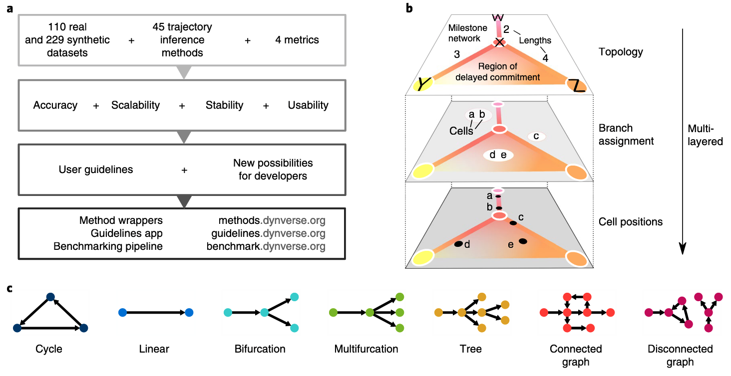
Figure 3.1. Different trajectory topologies and its comparison. Fig. adapted from Saelens et al, 2019
Here, we only introduce two commonly used methods. Note, all above trajectory inference methods are based on the current state of transcription and the distance between cell are symmetric, namely distance from cell A to cell B is the same as from cell B to cell A. Therefore, the direction of the inferred trajectory is either missing (namely require users to specify) or lack of high reliability if using default setting.
3.1.1 Diffusion map
Diffusion map is a type of non-linear dimension reduction methods, and is recently applied to estimate the pseudo-time in single-cell transcriptomic data (Haghverdi et al 2016).
As shown in Fig. 3.1 (adapted from Haghverdi et al 2016), this algorithm works with three steps:
- computing the overlap of local kernels at the expression levels of cells x and y;
- Diffusion pseudotime dpt(x,y) approximates the geodesic distance between x and y on the mapped manifold;
- Branching points are identified as points where anticorrelated distances from branch ends become correlated.
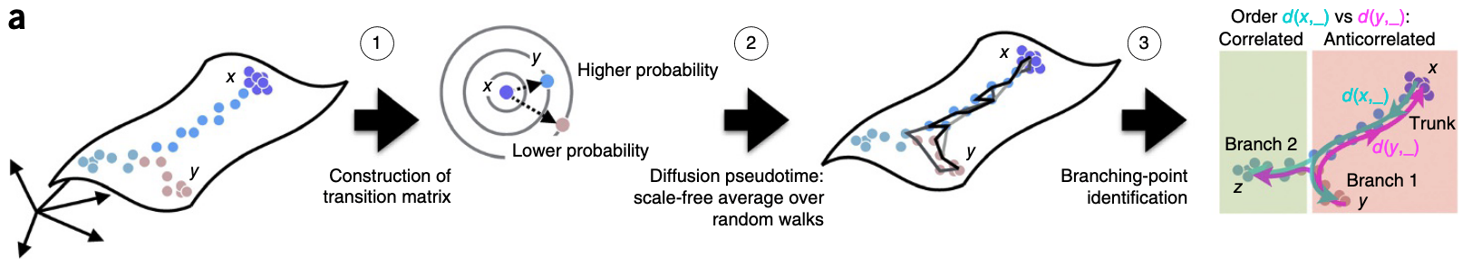
Figure 3.1. Diffusion-map pseudotime. Fig. adapted from Haghverdi et al 2016
3.1.2 Monocle
Another widely used tool is Monocle (now v3). One of cool features is that Monocle3 offers is the branching in the trajectory. On the other hand, it generally requires users to specify the start (or end) point in the trajectory.
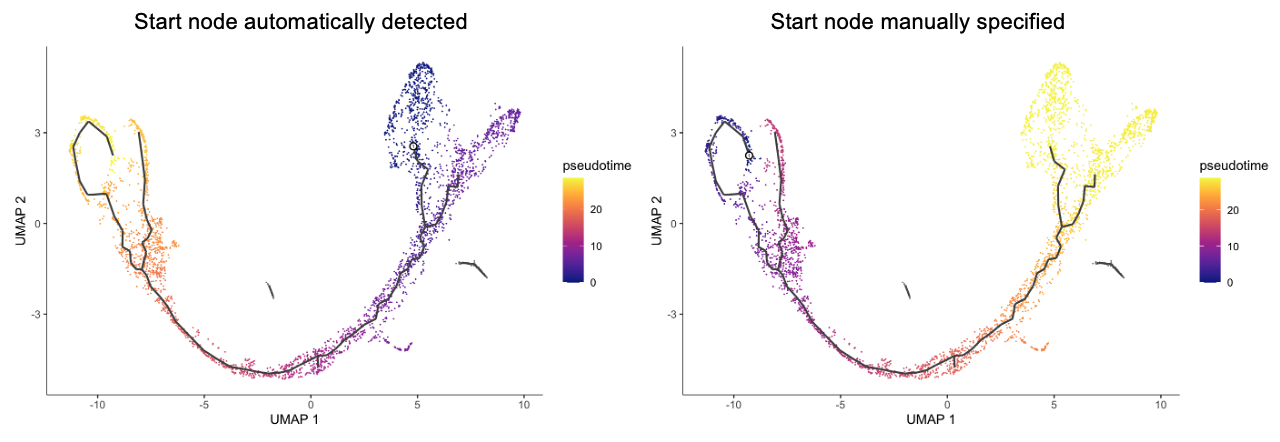
Figure 3.1. Results for Monocle3 for tutorial data below. Panels are based on different start nodes
3.2 RNA velocity
3.2.1 RNA kinetics
As briefly mentioned that the trajectory inferred from the transcriptome often suffers from lack of automatically detected direction. Very recently, the RNA velocity is introduced to use the unspliced RNAs to indicate the transcriptional kinetic activity (La Manno et al, 2018), and recently scVelo is further extends it to full dynamical model (Bergen et al, 2020).
Let us first review the RNA metabolic process and its intrinsic dynamics: - RNA is synthesized at a rate of alpha - RNA is spliced to remove introns and form mature mRNA at rate of beta - Mature mRNA is degraded after functioning at a rate of gamma
In steady state, the unspliced and spliced is at an equilibrium, namely the newly synthesized RNAs are exactly equal to the spliced RNAs, and similarly also the degradated RNAs. Therefore, the break of the equilibrium state between unspliced and spliced RNAs is highly informative and can indicate whether a gene is in the induction or suppression state.
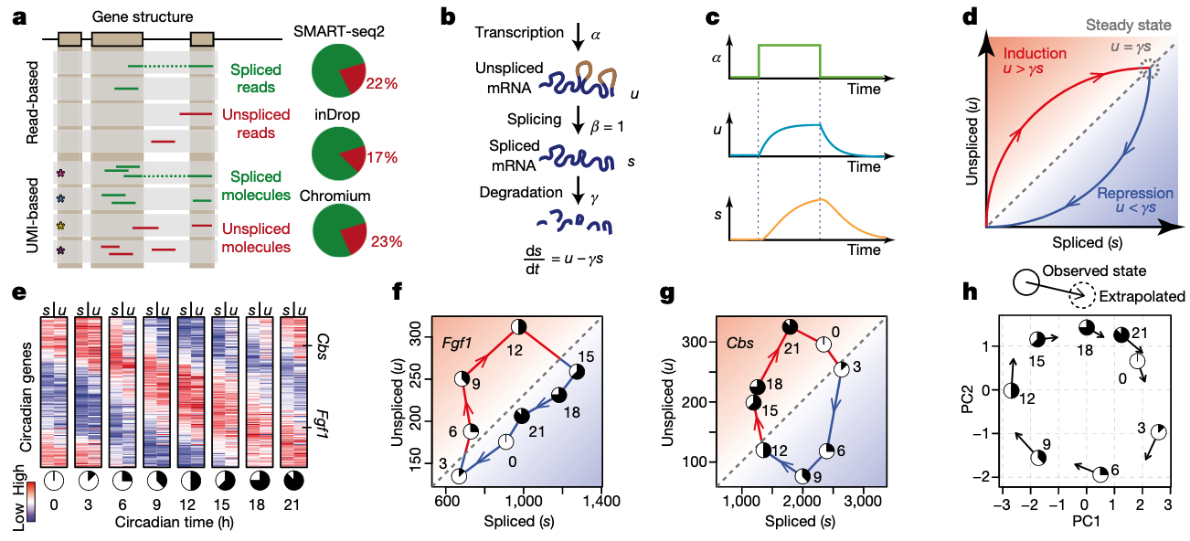
Figure 3.4. RNA kinetics and RNA velocity.Fig. adapted from Haghverdi et al 2016
3.2.2 Unspliced RNA indicates transcriptional speed
Usually, the proportion of unspliced RNAs is very low in RNA-seq, especially for protocols with Poly-A enrichment, which is very common. Namely, in principle, only RNAs reaching 3’ of the gene body can be captured. However, the unspliced RNAs still can be observed at a substantial proportion, usually covering 15-25%. The reason is still highly mysterious, partly biological for co-transcriptional splicing and partly technical for low efficiency on poly-A capturing.
Recently, there are also a few technologies have also been introduced to enrich the nascent RNAs in single-cell protocols, e.g., scSLAM-seq and scNT-seq.
Though some researchers remain skeptical on the use of RNA velocity, possibly because the high noise-by-signal ratio, the unprecedented capability to automatically detect the trajectory direction attracts much attention. At the same time, we anticipate more accurate and robust methods are coming soon thanks to the great community-wide efforts.
3.3 scVelo in R
There are two major tools for estimating RNA velocity:
- velocyto is based on a steady-state model. It supports both Python and R.
- scVelo supports a full dynamical model and various of utility functions. It only supports Python.
Here, we will introduce reticulate to use the scvelo Python package in R
(sounds cool, right? Hope you will find it handy!)
In order or use scVelo, we first need to install it. Please follow
Chapter 2.2 to install Python and scVelo==0.2.2.
Generally, the extraction of unspliced RNAs from raw reads is a bit tricky, and not widely supported. Please see Chapter 7.1 for three tested options for mroe details.
In this tutorial, we will download and use the built-in pancreas dataset from
scvelo that has already been preprocssed to count the unspliced RNAs to
demonstrate the useage of RNA velocity analysis. The dataset will be
automatically downloaded to ./data/Pancreas/endocrinogenesis_day15.h5ad
(52.5MB).
Note, this tutorial is translated from its Python version of scvelo at https://scvelo.readthedocs.io/Pancreas/
3.3.1 Getting started
First, let’s use load reticulate:
# install.packages("reticulate")
library(reticulate)
And check conda environment available, for example the sgcell environment is
available to use:
conda_list()## name
## 1 csnp
## 2 sgcell
## python
## 1 /Users/yuanhua/opt/anaconda3/envs/csnp/bin/python
## 2 /Users/yuanhua/opt/anaconda3/envs/sgcell/bin/pythonThen use reticulate to import Python packages scvelo and matplotlib:
use_condaenv("sgcell")
plt <- import("matplotlib.pyplot", as = "plt")
scv <- import ("scvelo")

scv$logging$print_version()
scv$settings$presenter_view = TRUE
scv$settings$verbosity = 3
scv$settings$set_figure_params("scvelo")
Endocrine development in pancreas lineage has four major fates: \(\alpha\), \(\beta\), \(\delta\), \(\epsilon\). Dataset is obtained and subseted from Bastidas-Ponce et al. (2018) by the scVelo team.
adata <- scv$datasets$pancreas()
adata
Note, to run velocity analysis on your own data, read your file with
adata = scv$read(file_path).
If you want to save model and parameters after processing, run the following command, adata$write(file_path, compression = 'gzip').
Now, let’s have a look of the proportions of unspliced/spliced mRNA reads, UMAP embedding and cluster annotations can be printed and visualized using built-in functions.
# create a folder named "images"
dir.create('images')

scv$utils$show_proportions(adata)
scv$pl$proportions(adata, figsize=c(10, 3), show=FALSE)
plt$savefig('images/RNA-velo-fig1.png')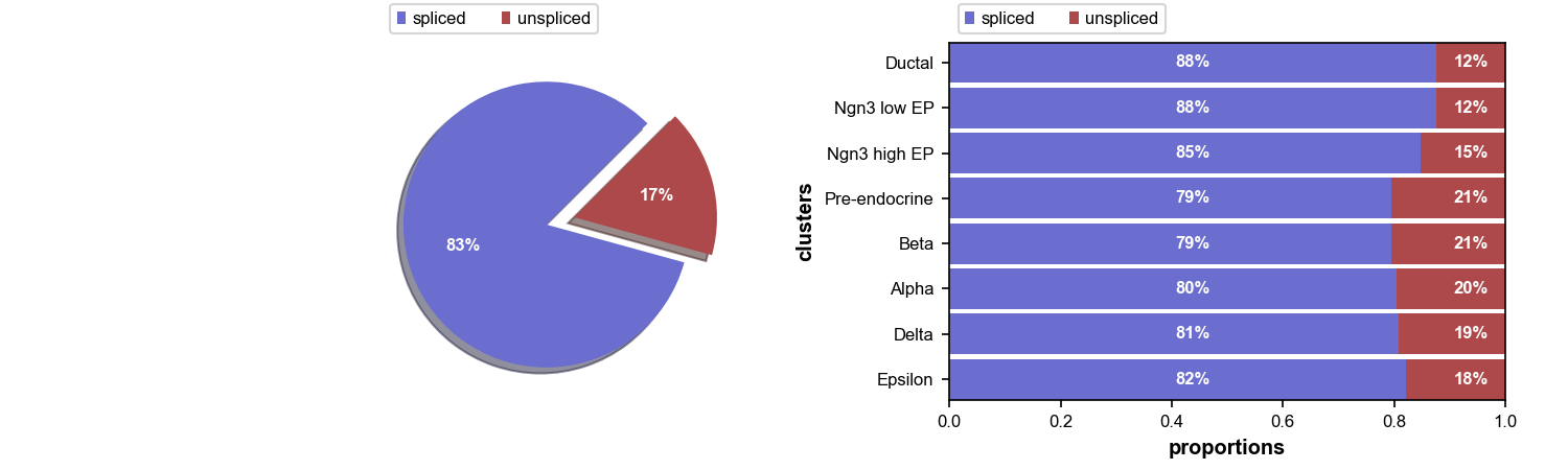
Figure 3.5. Proportion of unspliced RNAs
scv$pl$scatter(adata, legend_loc = "best", size = 50, title = "Pancreas Celltype", show=FALSE)
plt$savefig('images/RNA-velo-fig2.png')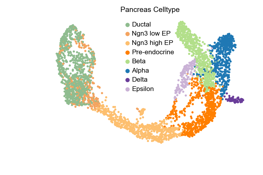
Figure 3.6 UMAP of Pancreas data with cell types
3.3.2 Data Preprocessing
Preprocessing contains:
- gene selection by detection (detected with a minimum number of counts)
- high variability (dispersion)
- normalizing every cell by its initial size and logarithmizing X
First and second order moments are also computed (mean, uncentered variance for deterministic, stochastic mode respectively) among nearest neighbors in PCA space.
scv$pp$filter_and_normalize(adata, min_shared_counts = as.integer(20), n_top_genes = as.integer(2000))
scv$pp$moments(adata, n_pcs = as.integer(30), n_neighbors = as.integer(30))
3.3.3 Diffusion pseudotime
Pseudotime, a part of standardized scRNA-seq analysis pipeline, is also implemented in this package, and can be compared with the latent time introduced in dynamical mode.
adata$uns$data$iroot <- which.min(adata$obsm['X_umap'][, 1])
scv$tl$diffmap(adata)
scv$tl$dpt(adata)

scv$pl$scatter(adata, color = 'dpt_pseudotime', title = 'pseudotime', color_map = 'gnuplot', colorbar = TRUE, rescale_color = c(0,1), perc=c(2, 98), show=FALSE)
plt$savefig('images/RNA-velo-fig3.png')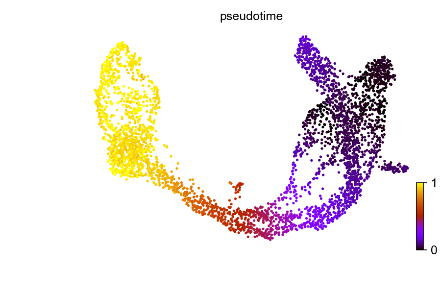
Figure 3.7. Diffusion pseudo-time
3.3.4 Compute velocity and velocity graph
scVelo has incorporated 3 modes for velocity estimation:
- Deterministic
- Stochastic
- Dynamical
For deterministic and stochastic mode, the gene-specific velocities are obtained by fitting linear regression ratio (constant transcriptional state) between unspliced/spliced mRNA abundances.
Under linear assumptions, how the observed abundances deviate from the steady state regression line is velocity.
scv$tl$velocity(adata, mode = "stochastic")To calculate velocity graph, we need to run velocity_graph(). Velocity graph is
the cosine correlation of potential cell transitions with velocity vector in high
dimensional space. It summarizes the possible cell transition states and has
dimension of \({n}_{obs} * {n}_{obs}\).
scv$tl$velocity_graph(adata, sqrt_transform = TRUE)3.3.5 Diffusion pseudotime with velocity
As mentioned above, the scvelo package support computing Diffusion Pseudotime. Before, we used cell transition matrix from spliced RNAs only. Now, let’s change the transition matrix to our computed velocity and calculate the diffusion pseudotime again. As you will see that the pseudotime is reversed. This is thanks to the use of velocity which is based on the intrinsic dynamics.
scv$tl$velocity_pseudotime(adata)
scv$pl$scatter(adata, color = 'velocity_pseudotime', cmap = 'gnuplot', show=FALSE)
plt$savefig('images/RNA-velo-fig4.png')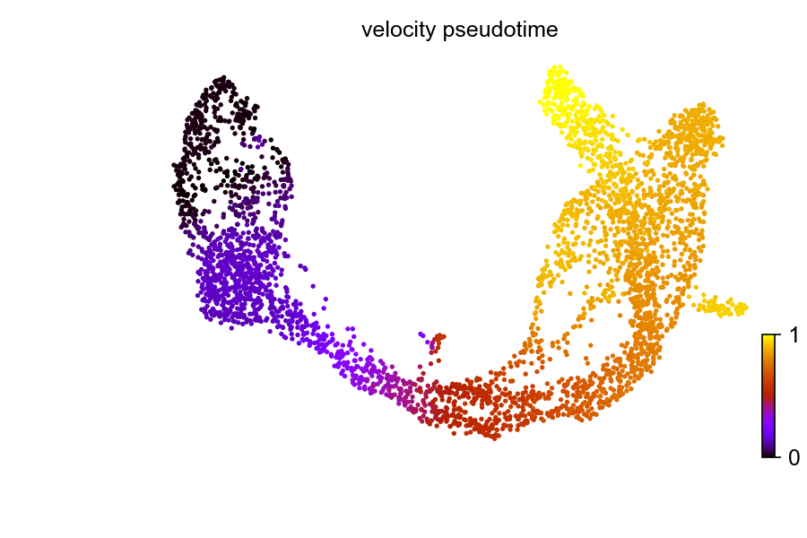
Figure 3.8. Diffusion pseudo-time with velocity
scv$pl$scatter(adata, x = "velocity_pseudotime", y = c('Actn4', 'Ppp3ca', 'Cpe', 'Nnat'), fontsize = 10, size = 10, legend_loc = 'best', color = 'clusters', figsize=c(12, 10), show=FALSE)
plt$savefig('images/RNA-velo-fig5.png')
Also, a few example genes along the pseduo-time.
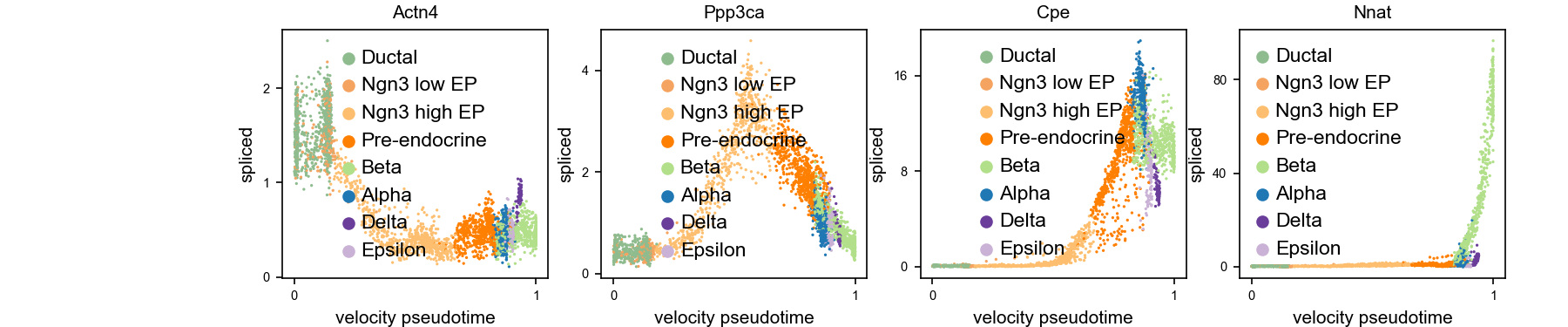
Figure 3.9. Expression along diffusion pseudo-time
3.3.6 Visualise velocity-based trajectory
Velocities are projected onto the specified embedding basis and can be visualized in one of the three ways:
- On single cell level
- On grid level
- Streamlines, which is most commonly used
scv$pl$velocity_embedding_stream(adata, basis = "umap", color = "clusters", legend_loc = "best", dpi = 150, show=FALSE)
plt$savefig('images/RNA-velo-fig6.png')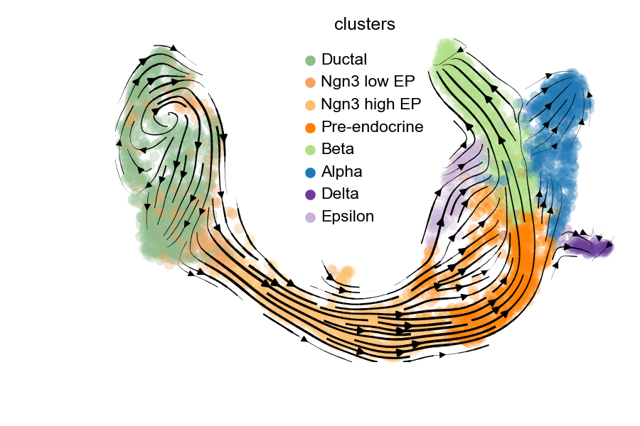
Figure 3.10. Visualisation of velocity-based trajectory
scv$pl$velocity_embedding(adata, basis = "umap", arrow_length = 3, arrow_size = 2, dpi = 150, show=FALSE)
plt$savefig('images/RNA-velo-fig7.png')
3.3.7 Interprete Velocity
We could also examine the phase portraits of interested genes to understand how inferred directions are supported by particular genes.
scv$pl$velocity(adata, c("Cpe", "Gnao1", "Ins2", "Adk"), ncols = 2, show=FALSE)
plt$savefig('images/RNA-velo-fig8.png')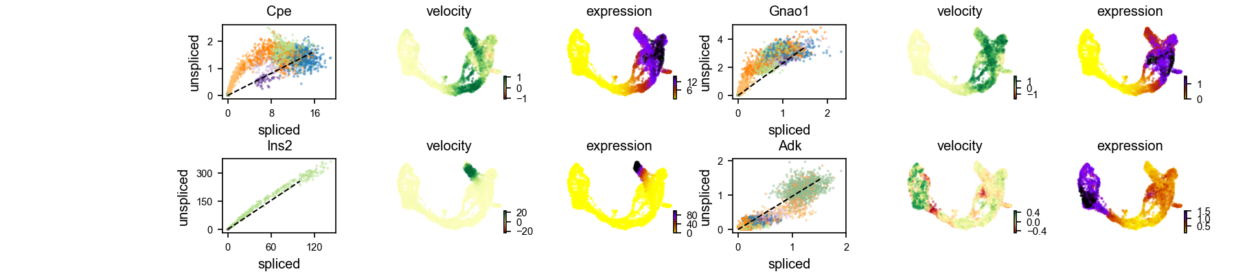
Figure 3.11. Visualisation of example genes
Positive velocity indicates that a gene is up-regulated, which occurs for cells that show higher abundance of unspliced mRNA for that gene than expected in steady state. Conversely, negative velocity indicates that a gene is down-regulated.
3.3.8 Velocity in cycling progenitors
The cell cycle detected by RNA velocity, is biologically affirmed by cell cycle scores (standardized scores of mean expression levels of phase marker genes).
scv$tl$score_genes_cell_cycle(adata)
scv$pl$scatter(adata, color_gradients = c("S_score", "G2M_score"), smooth = TRUE, perc = c(5, 95), legend_loc="upper center",  show=FALSE)
plt$savefig('images/RNA-velo-fig9.png')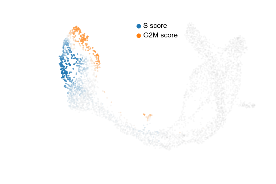
Figure 3.12. Visualisation of cell cycle
3.4 Last notes
Through this tutorial, the RNA velocity method has demostrated its unique power to reveal very detailed cell transitions, impressively the cell cycle trajecotry.
However, when you try it on your own data, sometimes, you may experience difficulty to inteprete the results. These difficulties are shared among groups on campus and across international community. At the moment, we are actively work on computational methods, including a few angles:
selection of genes with heterogenous transcriptional kinetics (differential momuntume genes) with our BRIE2 model
projection of the high dimentional RNA velocity into a low dimentional space for denoise and more robust analysis with our veloAE model
redesign of the scvelo dynamical model to a more generic mathathic function and biological informed regularisation (method is coming soon).
Feel free to get in touch (yuanhua@hku.hk) if you need advice on RNA velocity analysis on your own data / project.