Chapter 4 Introduction to Classification
4.1 Logistic regression
In this chapter, we will introduce classification. There are multiple commonly used classification methods, for example, random forest, support vector machine. Here, we will focus on introducing logistic regression for the following reasons:
- It usually performs well with good accuracy, especially after properly transforming the features to make them linear to the output variable.
- It is based on a linear relationship between the explanatory variables and output variable, making it easy to interpret.
- It has a good connection to a neural network, making it useful for your future study.
In a nutshell, logistic regression is a linear regression with a logistic transformation for probabilistic prediction. Let’s start with a linear decision boundary.
4.1.1 Linear decision boundary
Taking the iris dataset as an example, we will see that a linear boundary is a line in a two-dimensional space, and can be specified as a function over two variables, x1 (x-axis) and x2 (y-axis). Here, let’s take an example decision boundary: x2 = x2 - 2.3, or, namely, z = x1 - x2 - 2.3 = 0, and we can visualize it as follows.
## Example decision boundary as a line: x2 = x1 - 2.3; or z = x1 - x2 - 2.3 = 0
# Note, we use x2 as the y-axis. If z = x1 - x2 - 2.3 > 0, it's versicolor

ggplot(data = iris[1:100, ],
       aes(x = Sepal.Length, y = Sepal.Width, color = Species)) +
  geom_point() + geom_abline(intercept = -2.3)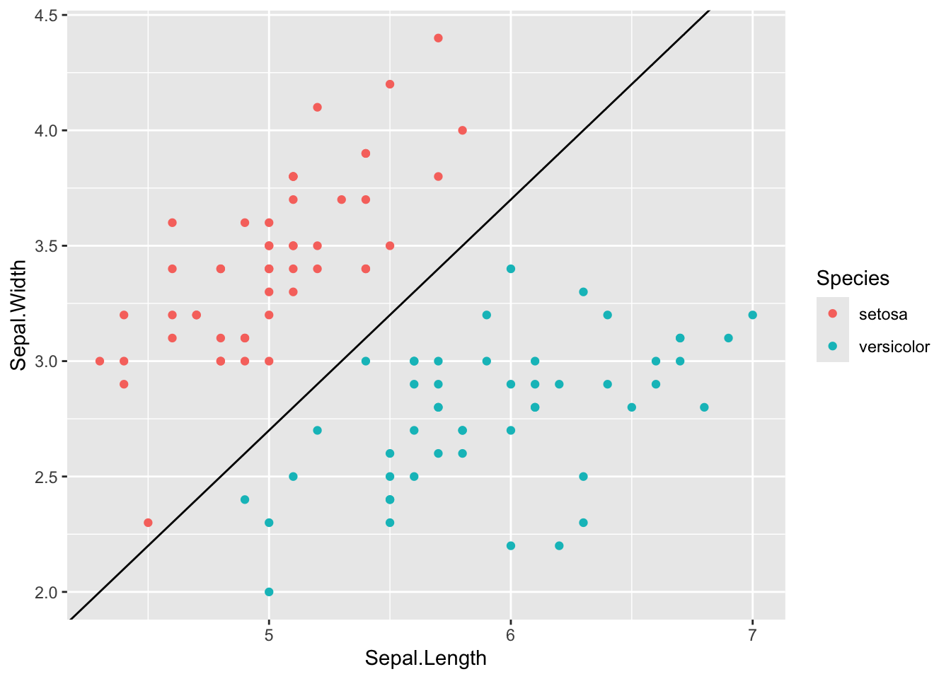
In high-dimensional space, a linear decision boundary will be a hyperplane. We can further write this linear decision model in a general form for \(p\)-dimensional features, as follows,
\[z = w_0 + w_1 * x_1 + w_2 * x_2 + ... w_p * x_p = 0\]
Then the classification will be make as positive if \(z>0\), or negative if \(z<0\).
Potential issues: there are two potential issues with the above linear classification. First, it cannot give a predicted probability of the label, which can be often useful for determine the confidence of the prediction. Second, it is not straightforward to define a loss with current predicted \(z\) and observed label \(y\).
To solve these issues, a logistic transformation function is introduced to squash the predicted value from (-\(\infty\), +\(\infty\)) to [0, 1], serving a the predicted probability. Therefore, the logistic regression can be written as follows,
\[P(y=1|X, W) = \sigma(z) = \sigma(w_0 + x_1 * w_1 + ... + x_p * w_p)\] where \(\sigma()\) denotes logistic function (also known as sigmoid function), defined as \[\sigma(z) = \frac{1}{1 + e^{-z}} = \frac{e^z}{e^z + 1}\]
4.1.2 Logistic and logit functions
Let’s play around with logistic and logit functions and then visualize them.
Logistic function
Let’s write our first function logestic() as follows.
# Write your first function
logistic <- function(y) {
  exp(y) / (1 + exp(y))
}

# Try it with different values:
logistic(0.1)
#> [1] 0.5249792
logistic(c(-3, -2, 0.5, 3, 5))
#> [1] 0.04742587 0.11920292 0.62245933 0.95257413 0.99330715
This is the equivalent to the built-in plogis() function in the stat
package for the
logistic distribution:
plogis(0.1)
#> [1] 0.5249792
plogis(c(-3, -2, 0.5, 3, 5))
#> [1] 0.04742587 0.11920292 0.62245933 0.95257413 0.99330715
Logit function
Now, let look at the logistic’s inverse function logit(), and let’s define it
manually. Note, this function only support input between 0 and 1.
# Write your first function
logit <- function(x) {
  log(x / (1 - x))
}

# Try it with different values:
logit(0.4)
#> [1] -0.4054651
logit(c(0.2, 0.3, 0.5, 0.7, 0.9))
#> [1] -1.3862944 -0.8472979  0.0000000  0.8472979  2.1972246
logit(c(-1, 2, 0.4))
#> Warning in log(x/(1 - x)): NaNs produced
#> [1]        NaN        NaN -0.4054651
Again, the built-in stat package’s logistic distribution has an equivalent
function qlogis(), though with a different name.
4.1.3 Visualise logistic and logit functions
Logistic function
# You can use seq() function to generate a vector
# Check how to use it by help(seq) or ?seq
x = seq(-7, 7, 0.3)
df = data.frame('x'=x, 'logistic'=plogis(x))

# You can plot by plot function
# plot(x=df$x, y=df$logistic, type='o')

# Or ggplot2
library(ggplot2)
ggplot(df, aes(x=x, y=logistic)) +
  geom_point() + geom_line()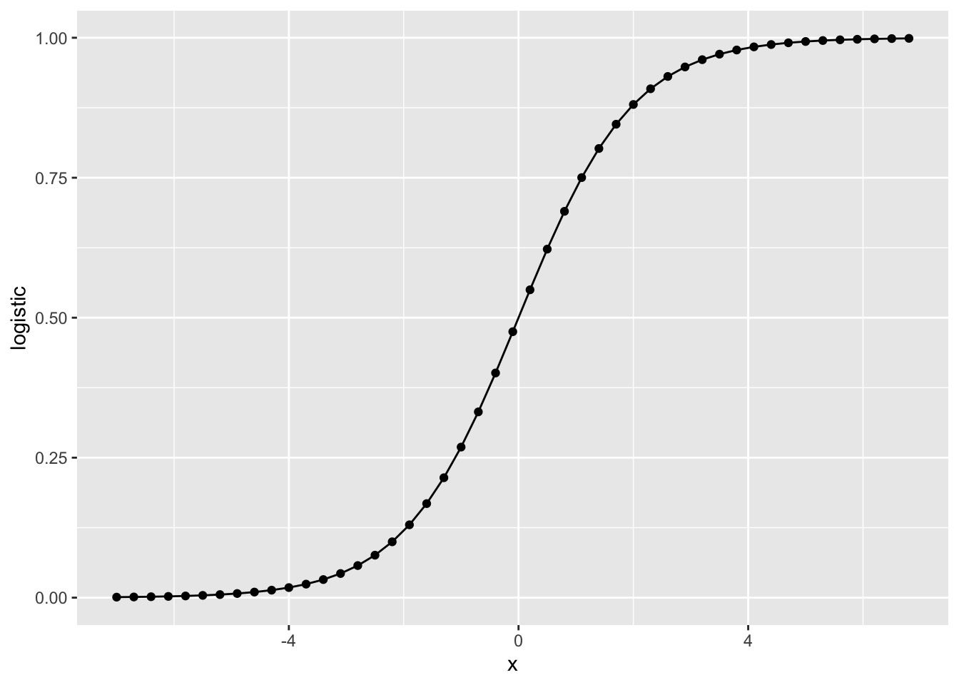
Logit function
x = seq(0.001, 0.999, 0.01)
df = data.frame('x'=x, 'logit'=qlogis(x))

ggplot(df, aes(x=x, y=logit)) +
  geom_point() + geom_line()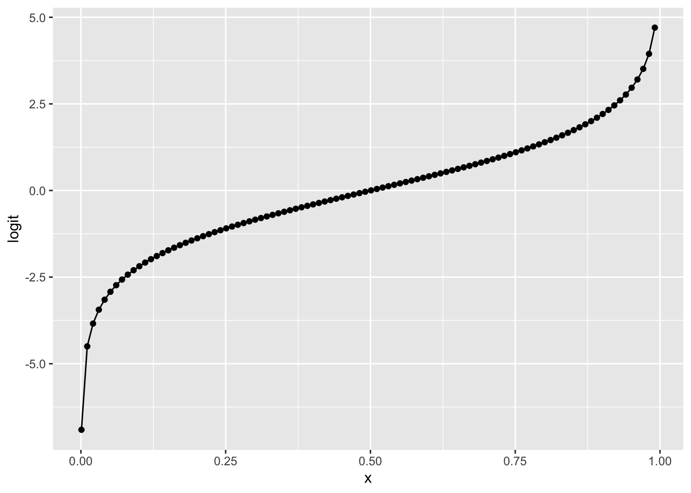
4.2 Application on Diabetes
4.2.1 Load Pima Indians Diabetes Database
This dataset is originally from the National Institute of Diabetes and Digestive and Kidney Diseases. The objective of the dataset is to diagnostically predict whether or not a patient has diabetes, based on certain diagnostic measurements included in the dataset. Several constraints were placed on the selection of these instances from a larger database. In particular, all patients here are females at least 21 years old of Pima Indian heritage.
The datasets consist of several medical predictors (independent variables) and one target outcome (dependent variable). Independent variables include the number of pregnancies the patient has had, their BMI, insulin level, age, and so on.
# Install the mlbench library for loading the datasets
if (!requireNamespace("mlbench", quietly = TRUE)) {
  install.packages("mlbench")
}

# Load data
library(mlbench)
data(PimaIndiansDiabetes)

# Check the first few lines
dim(PimaIndiansDiabetes)
#> [1] 768   9
head(PimaIndiansDiabetes)
#>   pregnant glucose pressure triceps insulin mass pedigree age diabetes
#> 1        6     148       72      35       0 33.6    0.627  50      pos
#> 2        1      85       66      29       0 26.6    0.351  31      neg
#> 3        8     183       64       0       0 23.3    0.672  32      pos
#> 4        1      89       66      23      94 28.1    0.167  21      neg
#> 5        0     137       40      35     168 43.1    2.288  33      pos
#> 6        5     116       74       0       0 25.6    0.201  30      neg
Now, let’s check two potential features: glucose and age, colored by the diabetes labels.
library(ggplot2)

ggplot(data=PimaIndiansDiabetes, aes(x=glucose, y=age)) +
  geom_point(aes(color=diabetes))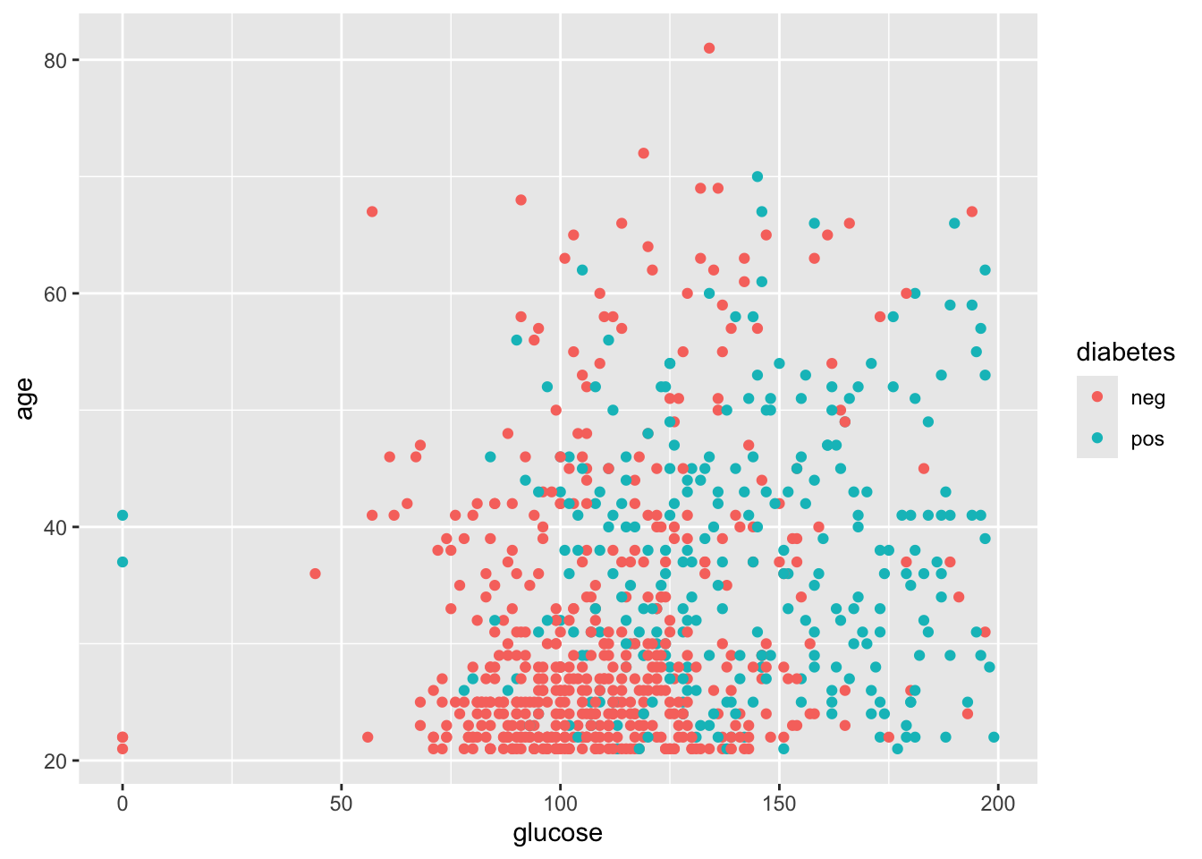
Before we start fitting models, let’s split the data into training and test sets in a 3:1 ratio. Let’s define it manually, though there are functions to do it automatically.
4.2.2 Fit logistic regression
In logistic regression, the predicted probability of being class 1 is:
\[P(y=1|X, W) = \sigma(w_0, x_1 * w_1 + ... + x_p * w_p)\]
where the \(\sigma()\) denotes the logistic function.
In R, the built-in package stats already has functions to fit
generalised linear model (GLM),
including logistic regression, a type of GML.
Here, let’s start with the entire dataset to fit a logistic regression model.
Note, we will specify the model family as binomial, as the likelihood we
are using in logistic regression is a Bernoulli likelihood, a special case of
binomial likelihood when the total trial n=1.
## Define formula in different ways
# my_formula = as.formula(diabetes ~ glucose + age)
# my_formula = as.formula(paste(colnames(PimaIndiansDiabetes)[1:8], collapse= " + "))
# my_formula = as.formula(diabetes ~ .)

## Fit logistic regression
glm_res <- glm(diabetes ~ ., data=df_train, family = binomial)

## We can use the logLik() function to obtain the log likelihood
logLik(glm_res)
#> 'log Lik.' -281.9041 (df=9)
We can use summary() function to see more details about the model fitting, including accessing the p-values.
summary(glm_res)
#>
#> Call:
#> glm(formula = diabetes ~ ., family = binomial, data = df_train)
#>
#> Coefficients:
#>              Estimate Std. Error z value Pr(>|z|)
#> (Intercept) -8.044602   0.826981  -9.728  < 2e-16 ***
#> pregnant     0.130418   0.036080   3.615 0.000301 ***
#> glucose      0.032196   0.004021   8.007 1.18e-15 ***
#> pressure    -0.017158   0.006103  -2.811 0.004934 **
#> triceps     -0.003425   0.007659  -0.447 0.654752
#> insulin     -0.001238   0.001060  -1.169 0.242599
#> mass         0.104029   0.018119   5.741 9.39e-09 ***
#> pedigree     0.911030   0.344362   2.646 0.008156 **
#> age          0.012980   0.010497   1.237 0.216267
#> ---
#> Signif. codes:  0 '***' 0.001 '**' 0.01 '*' 0.05 '.' 0.1 ' ' 1
#>
#> (Dispersion parameter for binomial family taken to be 1)
#>
#>     Null deviance: 756.83  on 575  degrees of freedom
#> Residual deviance: 563.81  on 567  degrees of freedom
#> AIC: 581.81
#>
#> Number of Fisher Scoring iterations: 5

## Access to the p-value
summary_glm <- summary(glm_res)
print("p-values can be access from the summary function:")
#> [1] "p-values can be access from the summary function:"
summary_glm$coefficients[, "Pr(>|z|)"]
#>  (Intercept)     pregnant      glucose     pressure      triceps      insulin
#> 2.297922e-22 3.006816e-04 1.178551e-15 4.933980e-03 6.547515e-01 2.425994e-01
#>         mass     pedigree          age
#> 9.388126e-09 8.155617e-03 2.162670e-01
4.2.3 Assess on test data
Now, we can evaluate the accuracy of the model on the 25% test data.
## Train the full model on the training data
glm_train <- glm(diabetes ~ ., data=df_train, family = binomial)

## Predict the probability of being diabeties on test data
# We can also set a threshold, e.g., 0.5 for the predicted label
pred_prob = predict(glm_train, df_test, type = "response")
pred_label = pred_prob >= 0.5

## Observed label
obse_label = df_test$diabetes == 'pos'

## Calculate the accuracy on test data
# think how accuracy is defined
# we can use (TN + TP) / (TN + TP + FN + FP)
# we can also directly compare the proportion of correctness
accuracy = mean(pred_label == obse_label)
print(paste("Accuracy on test set:", accuracy))
#> [1] "Accuracy on test set: 0.796875"
4.2.4 Model selection and diagnosis
Similar to the multiple linear regression, selecting the predictive features are essential to ensure the prediction performance in test sets. In theory, there could 2^{p} combinations of feature usage for \(p\)-dimensional features, making it a challenging task for selecting the best model, especially when \(p\) is large.
Here, we use a strategy of “recursive feature elimination”. Namely, we will include all features first and remove features with relatively large p-value (that we fail to reject the null distribution that the feature has a coefficient of zero).
Besides using p-value, we will also use the test set that we split from the entire dataset, which a general strategy in assessing performance in machine learning.
4.2.4.1 Model2: New feature set by removing triceps
## Train the full model on the training data

glm_mod2 <- glm(diabetes ~ pregnant + glucose + pressure +
                   insulin + mass + pedigree + age,
                data=df_train, family = binomial)

logLik(glm_mod2)
#> 'log Lik.' -282.0038 (df=8)
summary(glm_mod2)
#>
#> Call:
#> glm(formula = diabetes ~ pregnant + glucose + pressure + insulin +
#>     mass + pedigree + age, family = binomial, data = df_train)
#>
#> Coefficients:
#>               Estimate Std. Error z value Pr(>|z|)
#> (Intercept) -8.0317567  0.8251403  -9.734  < 2e-16 ***
#> pregnant     0.1308094  0.0361230   3.621 0.000293 ***
#> glucose      0.0324606  0.0039854   8.145 3.80e-16 ***
#> pressure    -0.0175651  0.0060269  -2.914 0.003563 **
#> insulin     -0.0014402  0.0009593  -1.501 0.133291
#> mass         0.1018155  0.0173811   5.858 4.69e-09 ***
#> pedigree     0.9000134  0.3428652   2.625 0.008665 **
#> age          0.0131238  0.0105147   1.248 0.211982
#> ---
#> Signif. codes:  0 '***' 0.001 '**' 0.01 '*' 0.05 '.' 0.1 ' ' 1
#>
#> (Dispersion parameter for binomial family taken to be 1)
#>
#>     Null deviance: 756.83  on 575  degrees of freedom
#> Residual deviance: 564.01  on 568  degrees of freedom
#> AIC: 580.01
#>
#> Number of Fisher Scoring iterations: 5
## Predict the probability of being diabeties on test data
# We can also set a threshold, e.g., 0.5 for the predicted label
pred_prob2 = predict(glm_mod2, df_test, type = "response")
pred_label2 = pred_prob2 >= 0.5
accuracy2 = mean(pred_label2 == obse_label)
print(paste("Accuracy on test set with model2:", accuracy2))
#> [1] "Accuracy on test set with model2: 0.807291666666667"4.2.4.2 Model3: New feature set by removing triceps and insulin
# Train the full model on the training data
glm_mod3 <- glm(diabetes ~ pregnant + glucose + pressure +
                   mass + pedigree + age,
                data=df_train, family = binomial)

logLik(glm_mod3)
#> 'log Lik.' -283.1342 (df=7)
summary(glm_mod3)
#>
#> Call:
#> glm(formula = diabetes ~ pregnant + glucose + pressure + mass +
#>     pedigree + age, family = binomial, data = df_train)
#>
#> Coefficients:
#>              Estimate Std. Error z value Pr(>|z|)
#> (Intercept) -7.797803   0.802287  -9.719  < 2e-16 ***
#> pregnant     0.130990   0.035957   3.643  0.00027 ***
#> glucose      0.030661   0.003755   8.164 3.23e-16 ***
#> pressure    -0.017847   0.005953  -2.998  0.00272 **
#> mass         0.097356   0.016969   5.737 9.61e-09 ***
#> pedigree     0.824150   0.338299   2.436  0.01484 *
#> age          0.015134   0.010426   1.452  0.14663
#> ---
#> Signif. codes:  0 '***' 0.001 '**' 0.01 '*' 0.05 '.' 0.1 ' ' 1
#>
#> (Dispersion parameter for binomial family taken to be 1)
#>
#>     Null deviance: 756.83  on 575  degrees of freedom
#> Residual deviance: 566.27  on 569  degrees of freedom
#> AIC: 580.27
#>
#> Number of Fisher Scoring iterations: 5
# Predict the probability of being diabeties on test data
# We can also set a threshold, e.g., 0.5 for the predicted label
pred_prob3 = predict(glm_mod3, df_test, type = "response")
pred_label3 = pred_prob3 >= 0.5
accuracy3 = mean(pred_label3 == obse_label)
print(paste("Accuracy on test set with model3:", accuracy3))
#> [1] "Accuracy on test set with model3: 0.786458333333333"4.3 Cross-validation
4.3.1 how to increase test sets
In the last section, we split the whole dataset into 75% for training and 25% for testing. However, when the dataset is small, the test set may not be big enough, hence introducing high variance in the assessment.
One way to reduce this variance in assessment is to perform cross-validation, where we split the data into K folds and use K-1 folds for training and the remaining fold for testing. This procedure will be repeated for fold 1 to fold K as testing fold, and all folds will be aggregated for joint assessment.
K is usually taken 3, 5, or 10. In the extreme case that K=n_sample, we call it leave-one-out cross-validation (LOOCV).
4.3.2 K-fold CV with caret package
Let’s load the dataset (again) first.
The procedure of cross-validation is straightforward; therefore, we may manually implement from scratch (try it yourself with a for loop).
On the other hand, there are also packages supporting the use of cross-validation
directly, including caret package. We will install it and use it for
cross-validation here.
Note, to calculate the ROC curve later, we need to keep the predicted probability by using
classProbs = TRUE
## Install the caret library for cross-validation
if (!requireNamespace("caret", quietly = TRUE)) {
  install.packages("caret")
}
library(caret)

## Define training control
# We also want to have savePredictions=TRUE & classProbs=TRUE
set.seed(0)
my_trControl <- trainControl(method = "cv", number = 5,
                             classProbs = TRUE,
                             savePredictions = TRUE)

## Train the model using train() function
cv_model <- train(diabetes ~ ., data = PimaIndiansDiabetes,
                  method = "glm",
                  family=binomial(),
                  trControl = my_trControl)

## Summarize the results
print(cv_model)
#> Generalized Linear Model
#>
#> 768 samples
#>   8 predictor
#>   2 classes: 'neg', 'pos'
#>
#> No pre-processing
#> Resampling: Cross-Validated (5 fold)
#> Summary of sample sizes: 615, 614, 615, 614, 614
#> Resampling results:
#>
#>   Accuracy   Kappa
#>   0.7708344  0.4695353
We can also access to detailed prediction results after concatenating the K folds:
cv_res = cv_model$pred
head(cv_res)
#>   pred obs       neg        pos rowIndex parameter Resample
#> 1  neg neg 0.9656694 0.03433058        4      none    Fold1
#> 2  neg neg 0.8581071 0.14189290        6      none    Fold1
#> 3  neg pos 0.9508306 0.04916940        7      none    Fold1
#> 4  neg pos 0.6541361 0.34586388       17      none    Fold1
#> 5  neg pos 0.7675666 0.23243342       20      none    Fold1
#> 6  neg pos 0.6132685 0.38673152       26      none    Fold1
We can double check the accuracy:
4.4 Metrics and ROC curve
4.4.1 Two types of error
In the above sections, we used the accuracy to perform model diagnosis, either only on one testing dataset or aggregating across multiple folds in cross- validation.
Accuracy is a widely used metric for model evaluation, based on the average error rate. However, this metric still has limitations when assessing the model performance, especially the following two:
When the samples are highly imbalanced, high accuracy may not mean a good model. For example, for a sample with 990 negative samples and 10 positive samples, a simple model by predicting all samples as negative will give an accuracy of 0.99. Thus, for highly imbalanced samples, we should be careful when interpreting the accuracy.
In many scenarios, our tolerance for false positive errors and false negative errors may be different, and we want to know both for a certain model. They are often called type I and II errors:
- Type I error: false positive (rate)
- Type II error: false negative (rate) - a joke way to remember them is that the II means two stripes in Negative.
Here, we use the diabetes dataset and its cross-validation results above to illustrate the two types of errors and the corresponding model performance evaluation.
## Let's start to define the values for the confusion matrix first
# Recall what the difference between & vs &&
# Read more: https://stat.ethz.ch/R-manual/R-devel/library/base/html/Logic.html

TP = sum((cv_res$obs == 'pos') & (cv_res$pred == 'pos'))
FN = sum((cv_res$obs == 'pos') & (cv_res$pred == 'neg'))

FP = sum((cv_res$obs == 'neg') & (cv_res$pred == 'pos'))
TN = sum((cv_res$obs == 'neg') & (cv_res$pred == 'neg'))

print(paste('TP, FN, FP, TN:', TP, FN, FP, TN))
#> [1] "TP, FN, FP, TN: 151 117 59 441"
We can also use the table() function to get the whole confusion matrix.
Read more about the
table function
for counting the frequency of each element.
A similar way is the
confusionMatrix()
in the caret package.
## Calculate confusion matrix
confusion_mtx = table(cv_res[, c("obs", "pred")])
confusion_mtx
#>      pred
#> obs   neg pos
#>   neg 441  59
#>   pos 117 151

## Similar function confusionMatrix
# conf_mat = confusionMatrix(cv_res$pred, cv_res$obs)
# conf_mat$table
We can also plot out the confusion matrix
## Change to data.frame before using ggplot
confusion_df = as.data.frame(confusion_mtx)

ggplot(confusion_df, aes(pred, obs, fill= Freq)) +
  geom_tile() + geom_text(aes(label=Freq)) +
  scale_fill_gradient(low="white", high="darkgreen")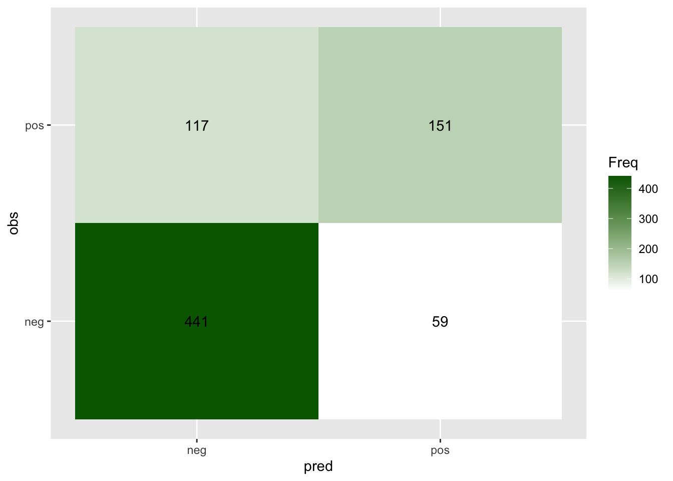
Also, the false positive rate, false negative rate, and true negative rate.
Note, the denominator is always the number of observed samples with the
same label, namely, they are a constant for a specific dataset.
FPR = FP / sum(cv_res$obs == 'neg')
FNR = FN / sum(cv_res$obs == 'pos')
TPR = TP / sum(cv_res$obs == 'pos')

print(paste("False positive rate:", FPR))
#> [1] "False positive rate: 0.118"
print(paste("False negative rate:", FNR))
#> [1] "False negative rate: 0.436567164179104"
print(paste("True positive rate:",  TPR))
#> [1] "True positive rate: 0.563432835820896"
4.4.2 ROC curve
In the above assessment, we only used \(P>0.5\) to denote the predicted label as positive. We can imagine that if we have a lower cutoff, we will have more false positives and fewer false negatives. Indeed, in different scenarios, people may choose different levels of cutoff for their tolerance of different types of errors.
Let’s try a cutoff \(P>0.4\). Think about what the results will be.
## Original confusion matrix
table(cv_res[, c("obs", "pred")])
#>      pred
#> obs   neg pos
#>   neg 441  59
#>   pos 117 151

## New confusion matrix with cutoff 0.4
cv_res$pred_new = as.integer(cv_res$pos >= 0.4)
table(cv_res[, c("obs", "pred_new")])
#>      pred_new
#> obs     0   1
#>   neg 408  92
#>   pos  89 179
Therefore, we may want to assess the model performance by varying the cutoffs and obtain a more systematic assessment.
Actually, the Receiver operating characteristic (ROC) curve is what you need. It presents the TPR (sensitivity) vs the FPR (i.e., 1 - TNR or 1 - specificity) when varying the cutoffs.
To achieve this, we can calculate FPR and TPR manually by varying the
cutoff through a for loop. Read more about
for loop and you may try
write your own, and here is an example from the
cardelino package.
For simplicity, let’s use an existing tool implemented in the pROC package to
obtain the key information for making ROC curves: sensitivities (TPR) and
specificities (1-FPR) for a list of thresholds:
## Install the pROC library for plotting ROC curve
if (!requireNamespace("pROC", quietly = TRUE)) {
  install.packages("pROC")
}

# library(pROC)
roc_outs <- pROC::roc(cv_res$obs == 'pos', cv_res$pos)
#> Setting levels: control = FALSE, case = TRUE
#> Setting direction: controls < cases
print(paste("The AUC score of this ROC curve is", roc_outs$auc))
#> [1] "The AUC score of this ROC curve is 0.829082089552239"

roc_table <- as.data.frame(
  roc_outs[c("sensitivities", "specificities", "thresholds")]
)
head(roc_table)
#>   sensitivities specificities  thresholds
#> 1     1.0000000         0.000        -Inf
#> 2     1.0000000         0.002 0.001848584
#> 3     1.0000000         0.004 0.003167924
#> 4     1.0000000         0.006 0.004588208
#> 5     1.0000000         0.008 0.005750560
#> 6     0.9962687         0.008 0.007297416
With this roc_table at hand, we can find which threshold we should use for a
certain desired FPR or TPR, for example, to have FPR = 0.25:
FPR = 1 - roc_table$specificities

idx = which.min(abs(FPR - 0.25))
roc_table[idx, ]
#>     sensitivities specificities thresholds
#> 444     0.7462687          0.75  0.3278307

print(paste("When FPR is closest to 0.25, the threshold is", roc_table[idx, 3]))
#> [1] "When FPR is closest to 0.25, the threshold is 0.327830708502212"
print(paste("When FPR is closest to 0.25, the TPR is", roc_table[idx, 1]))
#> [1] "When FPR is closest to 0.25, the TPR is 0.746268656716418"
By showing all thresholds, we can also directly use ggplot2 to make an ROC curve:
library(ggplot2)

## You can set the n.cuts to show the cutoffs on the curve
g = ggplot(roc_table, aes(x = 1 - specificities, y = sensitivities)) +
  geom_line(color = "blue", size = 1) +
  geom_abline(linetype = "dashed", color = "grey") +
  labs(title = "ROC Curve",
       x = "FPR (1 - Specificity)",
       y = "TPR (Sensitivity)") +
  coord_equal()

## Display the plot with more annotations
g +
  annotate("text", x=0.8, y=0.1, label=paste("AUC =", round(roc_outs$auc, 4))) +
  geom_point(x = 1 - roc_table[idx, 2], y = roc_table[idx, 1]) +
  geom_text(x = 1 - roc_table[idx, 2], y = roc_table[idx, 1],
            label = round(roc_table[idx, 3], 3), color = 'black', hjust = -0.3)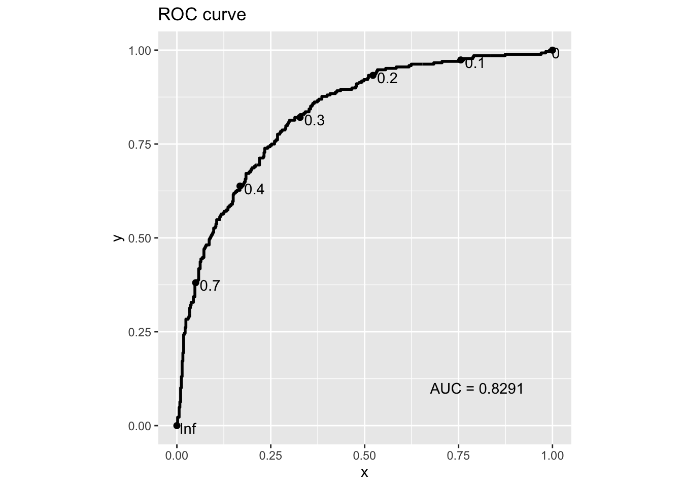
Acknowledgement: This notebook is adapted and updated from STAT1005.